
Welcome back! In our last blog post, we used AWS QuickSight’s basic features to analyze the gender gap in the tech industry. In this post, we will take a closer look at the newer QuickSight technologies designed to make data analysis simpler and more effective. We will explore QuickSight Q, Forecasts and Insights, and uncover the practical applications of each. Delve into the power of data analysis with us and let’s get started!
QUICKSIGHT Q
What is Quicksight Q?
First and foremost, QuickSight Q is a natural language query (NLQ) tool used for BI analysis that allows users to ask business-related questions and receive the most representative visualizations as answers. What sets QuickSight Q apart from any other business intelligence tool is its capability to provide data-driven insights – in response to analytical queries – through the leverage of machine learning technologies.
QuickSight Q strives to reduce the need for BI expertise in order to analyze the data, achieving this by providing the most accurate visuals based on its interpretation of natural language. With its intuitive data analysis skills, Q is sure to revolutionize the way companies interact with their data.
Now that we have discussed the theoretical aspects of Q, let’s dive into the more practical applications of the technology, its most important features and how they can help us visualize and comprehend our data.
How does Q work? A practical look into it
By far the most important feature to understand when getting started with QuickSight Q is “Topics”. As defined by Zac Woodall at AWS re:Invent, topics are a collection of data that align with a subject area that your business users can ask questions about (1). In simpler terms, these are the data Q utilizes in order to answer the given questions. We will be using the dataset from our first blog post about the gender gap in the tech industry to examine how we can create a topic and kickstart our QuickSight Q journey!
In order to create a topic that enables us to ask questions about Kaggle’s surveys, QuickSight offers two alternatives. The first option involves creating the topic from scratch, linking it to an already existing QuickSight dataset. While the second option entails creating a topic directly from an analysis we want to derive new insights from. Let’s see what the latter looks like.
Create and Edit New Topic From Analysis

When the Enterprise + Q subscription in QuickSight is enabled, automatically, all of your analyses will include an upper search bar that will allow you to ask questions about your data. Before we can do this though, we need to “Enable a topic” with the current dataset used in the analysis.
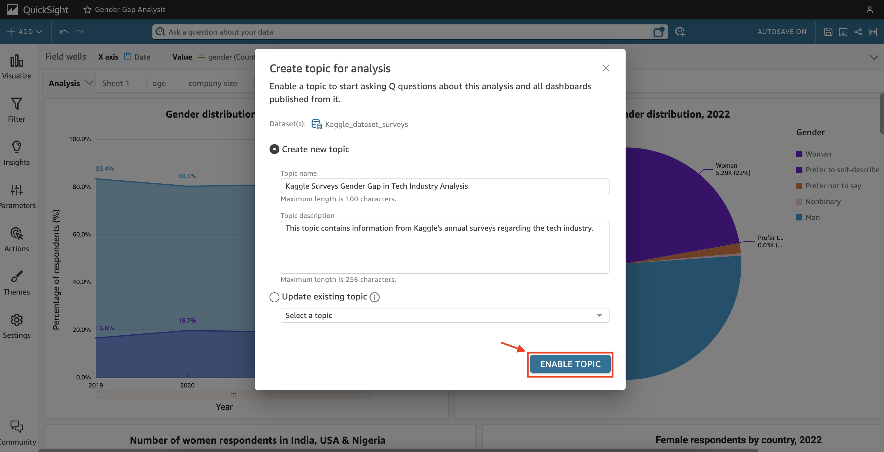
After clicking on “Enable topic”, a window should pop-up where we will be able to name our topic and explain what information can be found in it. QuickSight Q by default selects the dataset used in the analysis, so in case of wanting to ask questions about a different dataset, then you will need to create a new topic separately based on that data.
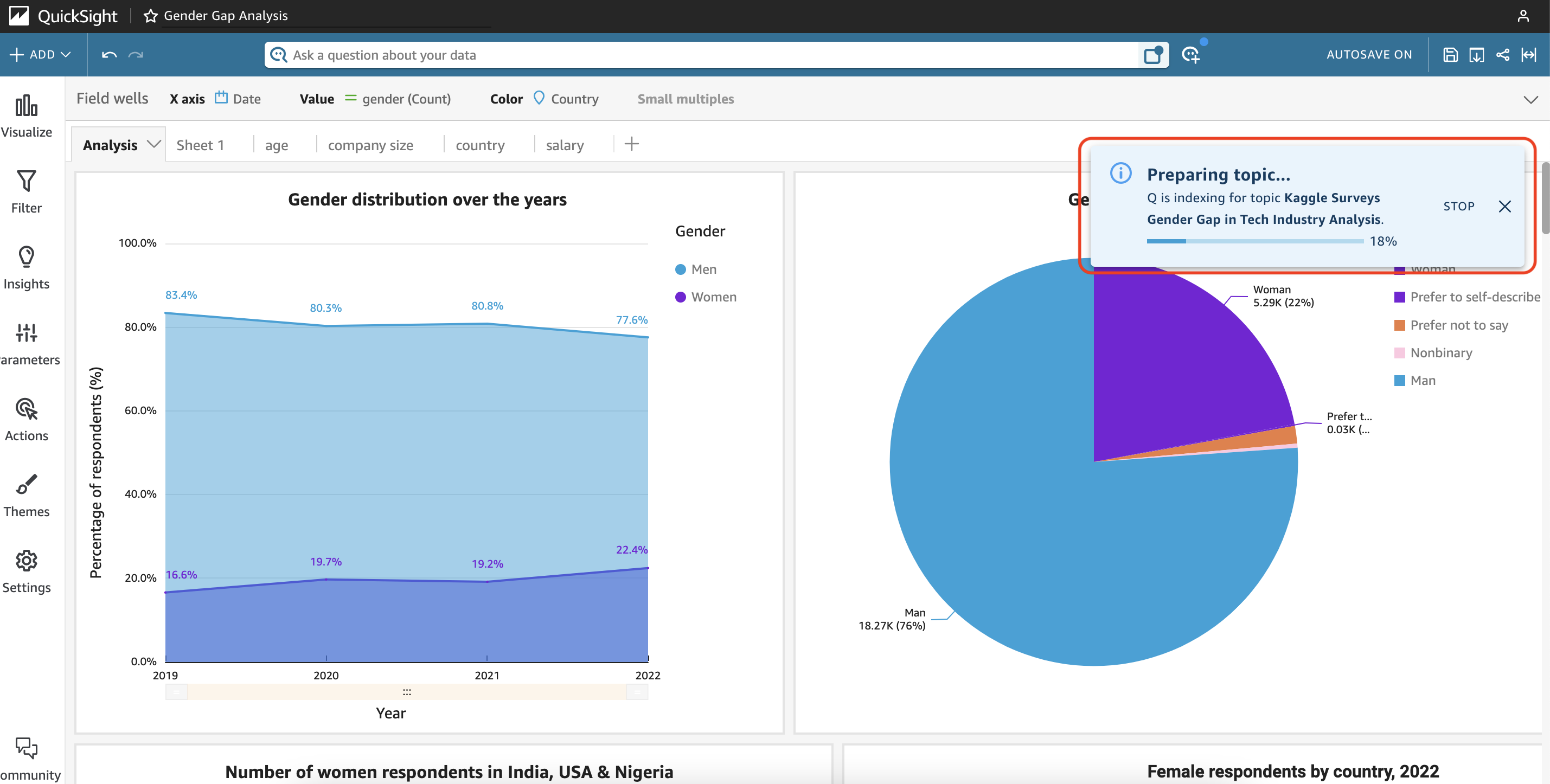
Once we have completed that step, QuickSight Q will start indexing and configuring the analysis’ data. But you might be wondering, what exactly is indexing? This is the process by which an AI system looks into and prepares your data for natural language processing. What QuickSight does is examine every feature in the data – from the name of each column to the data type of these – and renames the associated columns to make them more understandable, while simultaneously identifying synonyms users might use to refer to the data.
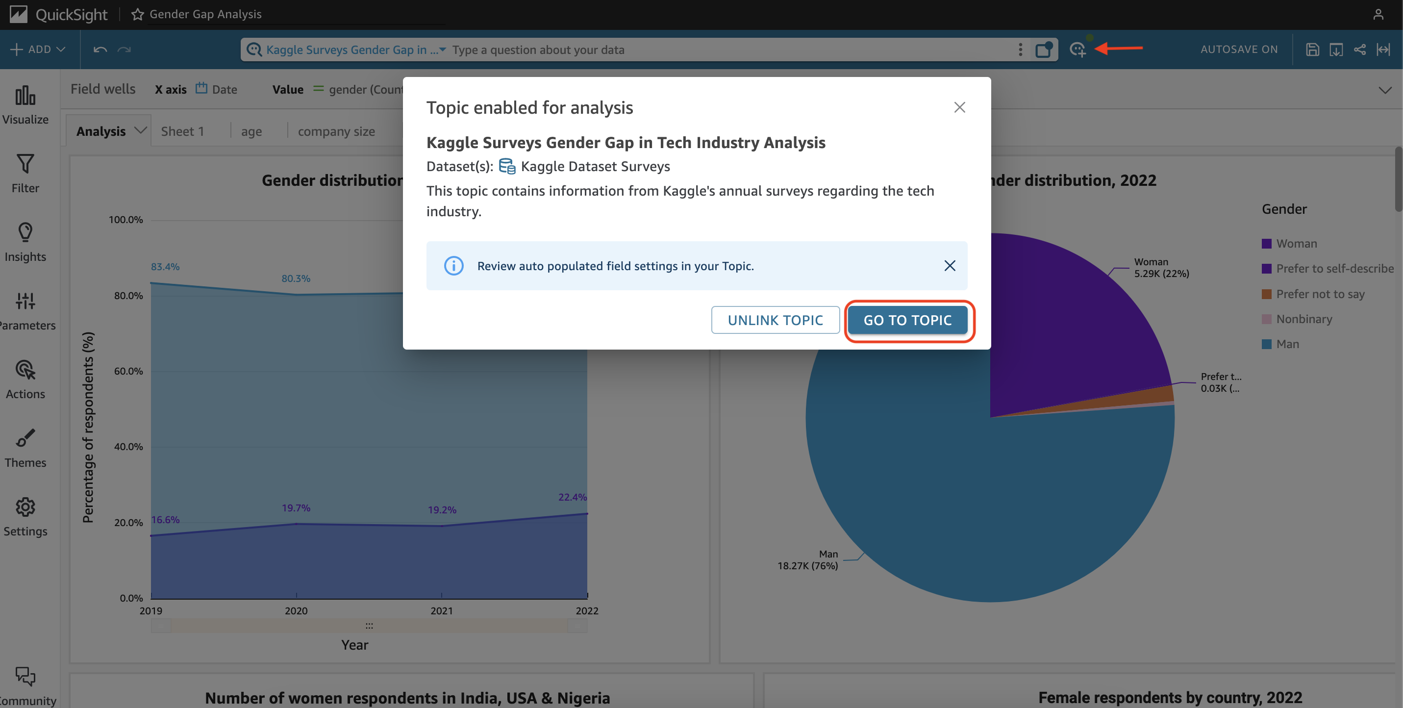
After the indexing process is completed, the search bar will have the topic enabled, allowing users to start making questions. However, before doing so, it is important to review the topic configuration to ensure that Q’s performance is optimized and that users receive the best possible answers to their questions.
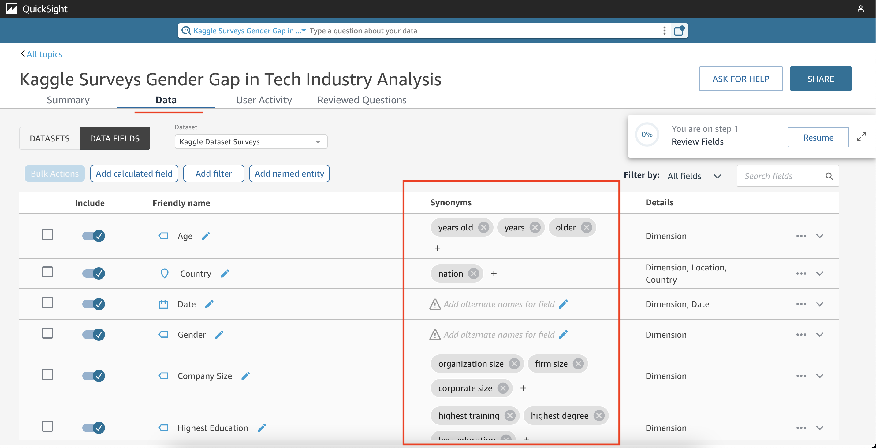
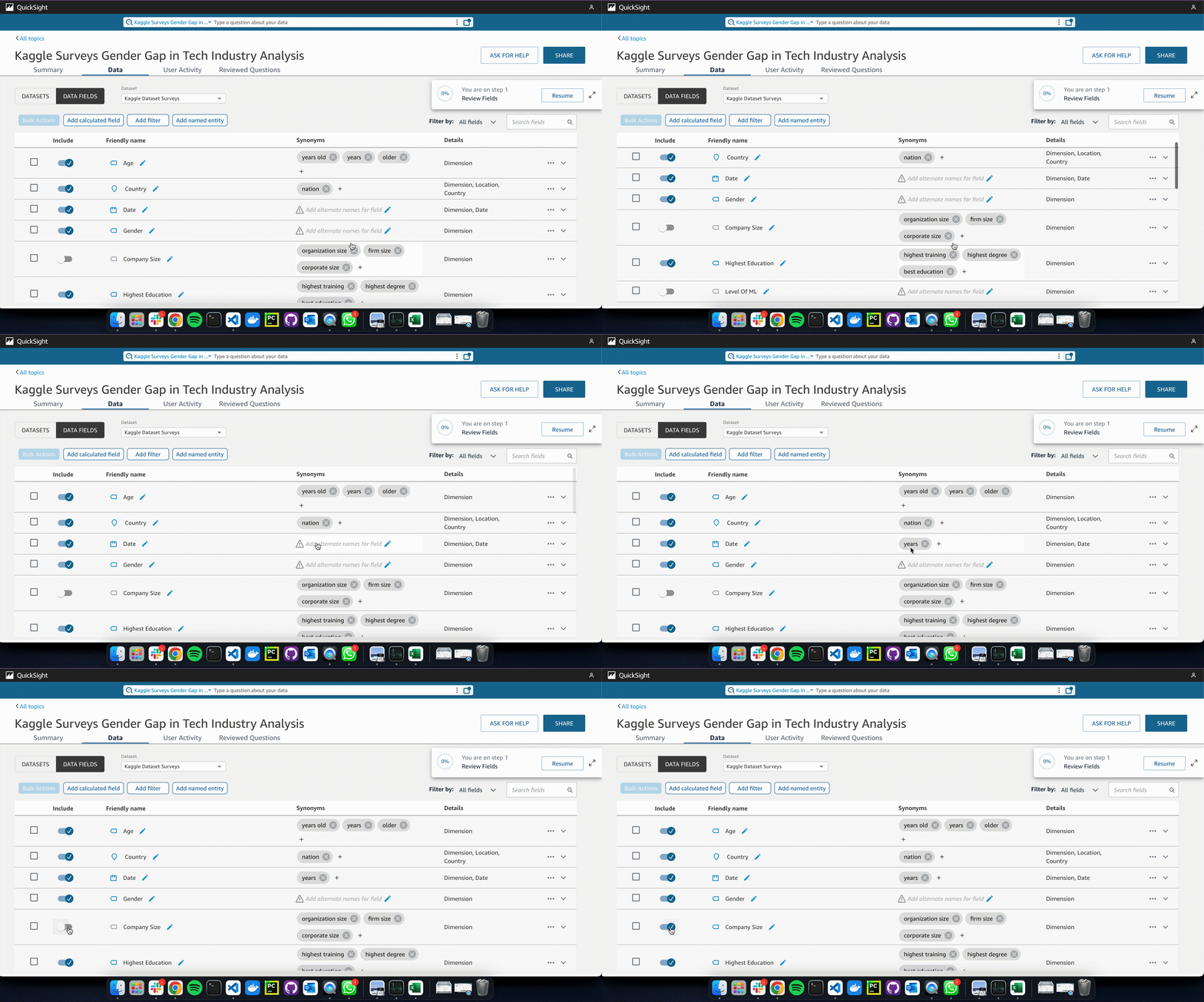
Inside the topic configurations, we can make alterations to help Q draw conclusions from data. For example, we can include or exclude attributes from which Q will generate visuals, as well as adding or removing synonyms to enhance QuickSight Q’s understanding of what we want to visualize. It is important to keep in mind that the synonyms and field names should be unique since Q uses these in order to link questions with them. By ensuring these settings are correct, we can help maximize Q’s performance and accuracy of responses.
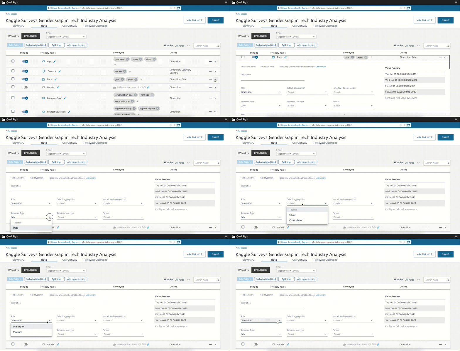
Moreover, we have the option to modify the data type and add details like the default aggregation and semantic type in each data field. QuickSight Q already creates these configurations automatically, however, we must review them to ensure each field is classified correctly. If we don’t, Q could omit key elements from the data, consequently affecting the responses.
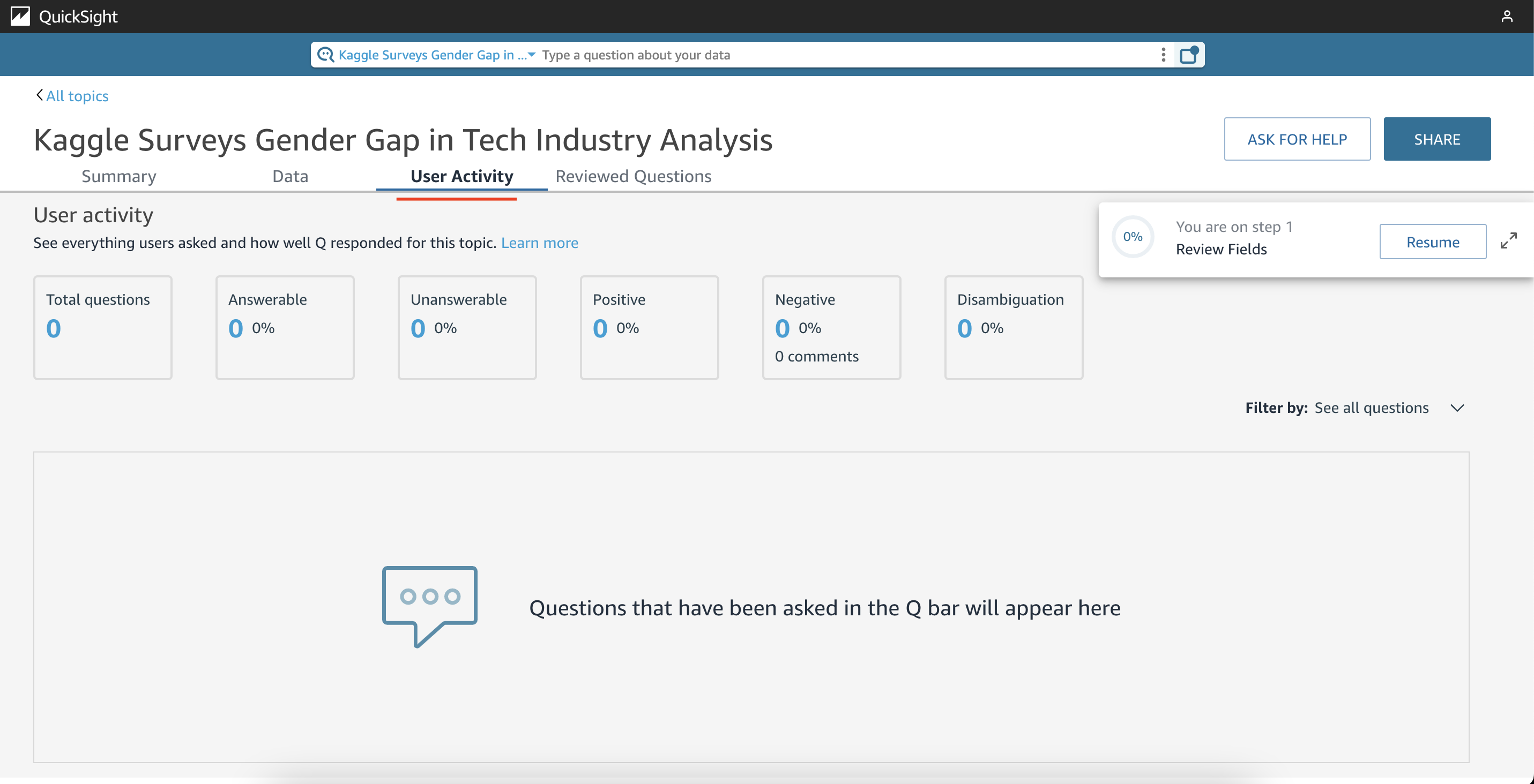
Finally, it is worth mentioning the “User Activity” tab, where QuickSight Q displays a quick evaluation of its answers, for instance how many of them we thought answered our question.
Let’s get Q-rious!
Having outlined the functionality of Q, let me provide some examples of how it can be used to create quick analysis. Say we wanted to visualize the number of respondents throughout time and by gender. One option would be to just ask Q “show gender by date” and that would give us the answer we are looking for, like portrayed in the image below.
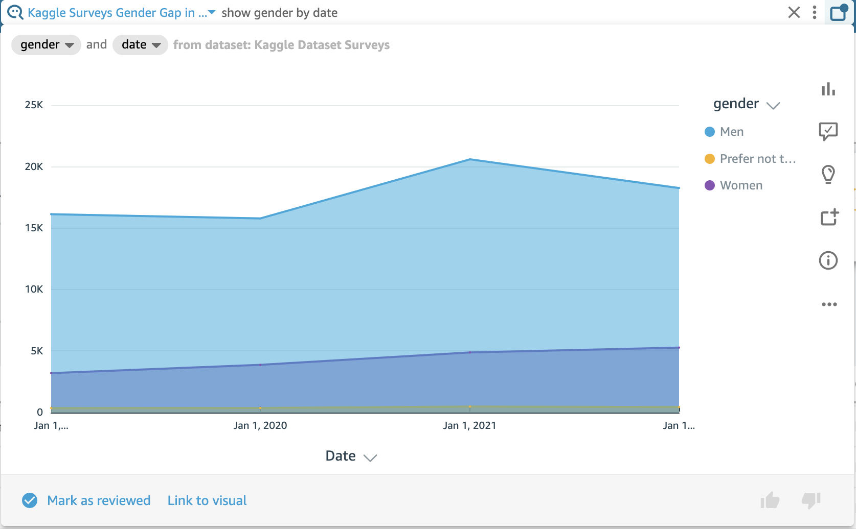
However, what would happen if another user asks the same question but with slightly different wording? For instance, “show respondents by year”. Given the field synonyms that QuickSight Q identified, that information cannot be answered. This is what is meant when saying it is the author’s responsibility to review questions users ask and modify the data labels to help Q provide better answers.

So if we want to improve results, we should add some synonyms to the list and try if by doing that Q recognises what we want.


By adding the tags “year”, “years” for the field Date; “respondents”, “women”, and more for gender, we are telling QuickSight Q to use said fields when a question contains those words. This should help us get the results we want.
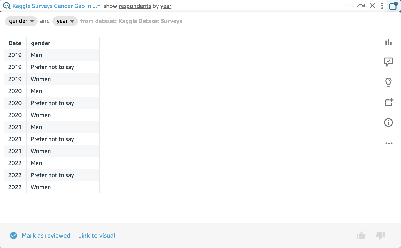
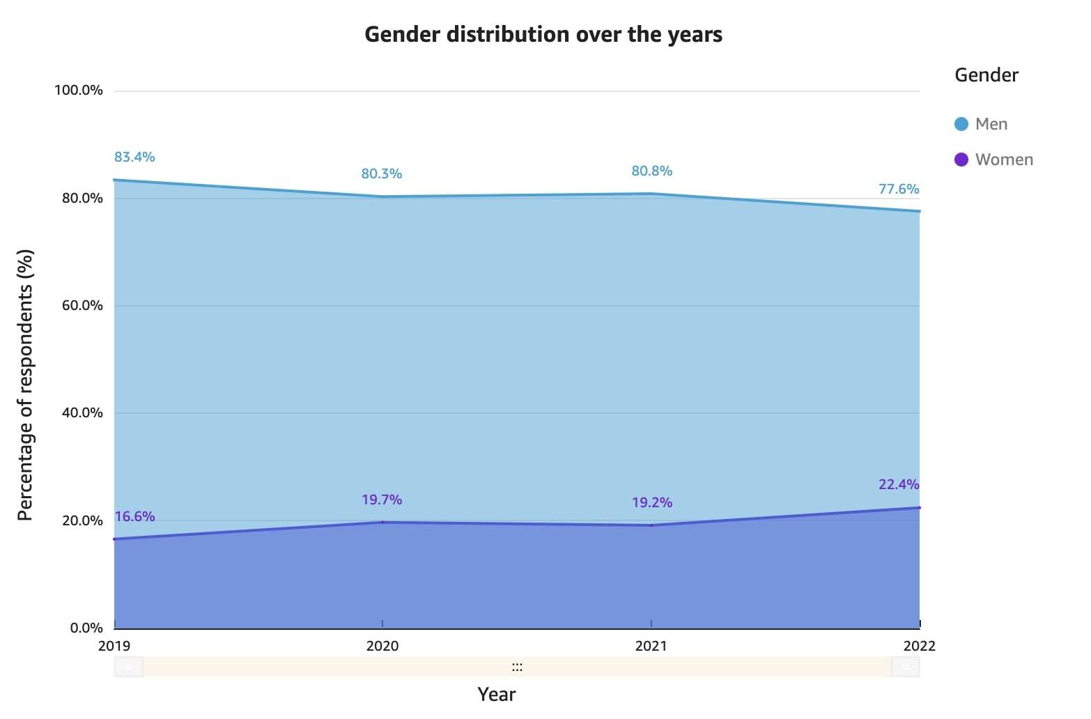
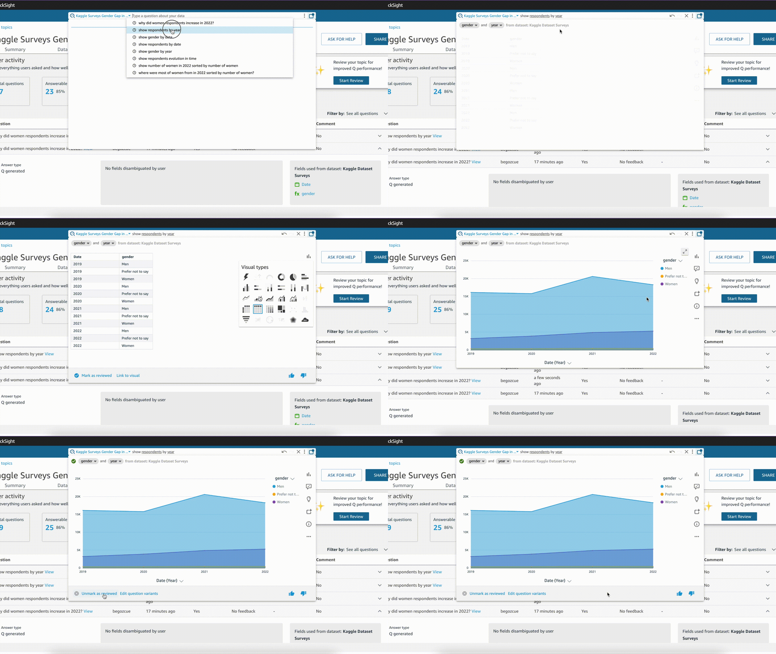
As evidenced in the plot above, by incorporating new words to the analysis, QuickSight Q returns a visual that shows how we can obtain results that better adhere to our natural language. However, a table is not the most effective way to illustrate the number of respondents over time. Fortunately, QuickSight Q enables users to switch to a more suitable visual type that meets their requirements.
Simultaneously, by clicking on the “Mark as reviewed” button, when new users ask questions about our dataset, they will be able to observe how the question was approved by the author. So next time, instead of displaying the initial visual in table form, Q will have learnt that the desired visual type is an area graph.
“Why” feature
Another of Q’s most impressive features is its ability to provide analytical explanations as to why certain things are occurring in your data. For example, in the last graph, we could see how the number of women respondents increased in 2022, but it may not be immediately apparent why this happened. By writing the prompt “why did women respondents increase in 2022?” QuickSight Q offers us an overview of the different fields in our dataset which contributed the most to this increase.
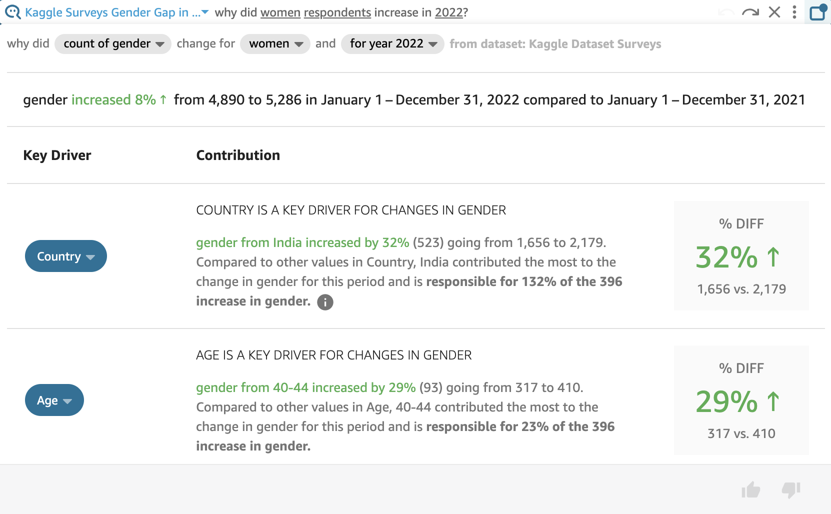
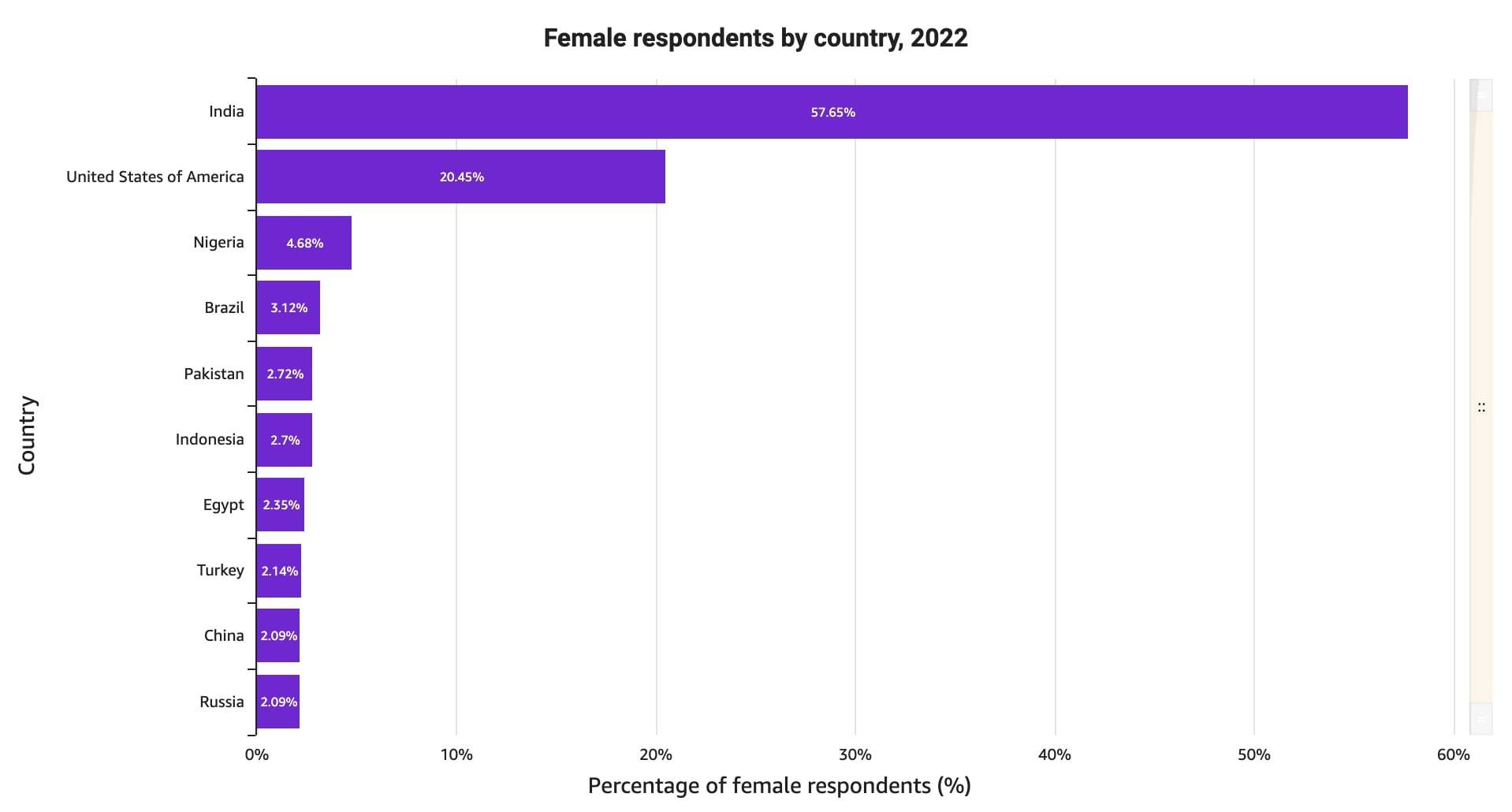
As depicted in the image, Q identified that the total number of women had risen 8% between 2021 and 2022. Moreover, Q provides further insight into the fields that are considered to be “key drivers” for this change. For example, the number of female respondents that were from India increased by 32%, being deemed responsible for 132% of the increase of female surveyees. This aligns with what was discussed in the last blog post, regarding the ongoing growth of the tech industry, particularly in India.
It also informs us that women in the 40-44 demographic increased by 29%, contributing a total of 23% to the overall increase. These insights are similar to those we reached in our first blog post, just by analyzing the data. This demonstrates how we can reach similar conclusions, and understand why our data is behaving in a certain way without BI expertise, simply by asking Q.
We could go on and on about QuickSight Q’s remarkable features, but the ones mentioned above are the ones that, personally, stood out the most. These features provide the insights and understanding necessary to get the most out of your data so you can analyze it like a pro in no time!
QuickSight Forecasts & Insights
An Introduction to Forecasts and Insights
Moving onto other Machine Learning-powered QuickSight technologies, we can discover Insights and generate Forecasts. The first tool helps us uncover hidden outliers and insights that may be difficult to identify at first glance in our data. On the other hand, AWS QuickSight Forecasts enables users to predict future values based on historical data, by utilizing sophisticated algorithms that generate those forecasts.
Similarly to QuickSight Q’s purpose, QuickSight Forecasts and Insights are designed to be used even without prior Machine Learning expertise, reducing the reliance on analysts to understand and draw conclusions from our data. By making these tools accessible and easy to use, users can quickly identify patterns and phenomena in their data, and make more informed decisions.
In order to gain a better understanding of these QuickSight technologies, let’s once again look at some practical examples of what one can create, and how these tools can help us comprehend our data.
Quick~Insights!
If you want to get powerful insights from QuickSight, it is important to first create graphs and allow the tool to start analyzing your filtered data and draw conclusions from the plots. These do not need to be the fanciest of plots – just select a few features and you are good to go! It is worth keeping in mind, though, that filtered data will provide more specific insights, rather than generic ones.
In order to access the auto-generated insights, we should look at the left toolbar and click on Insights.
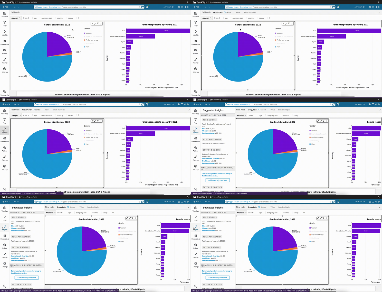
Once the Insights tab is selected, QuickSight will show multiple widgets that contain data insights that have been gathered from the fields used in our graph. Take the following image as an example.
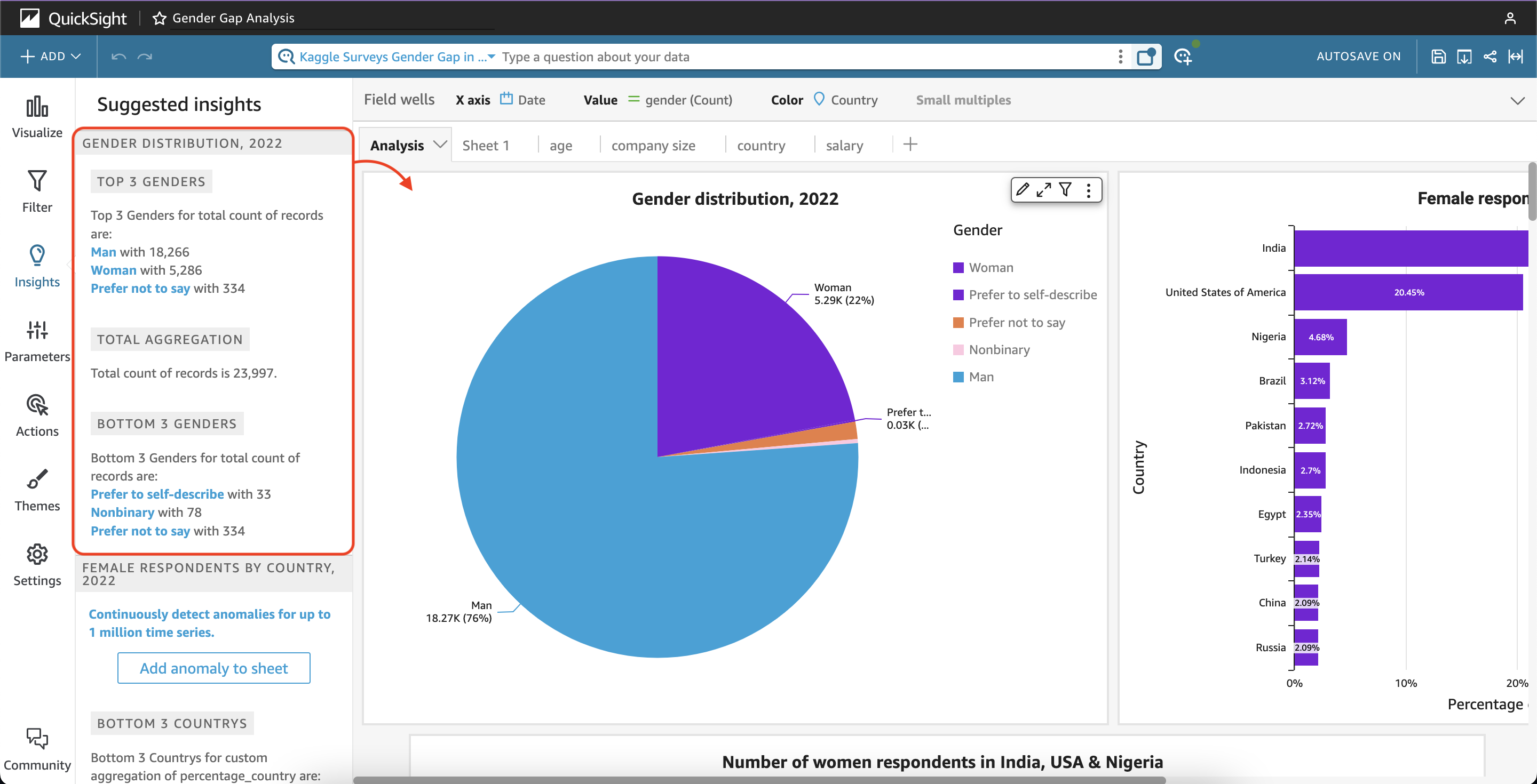
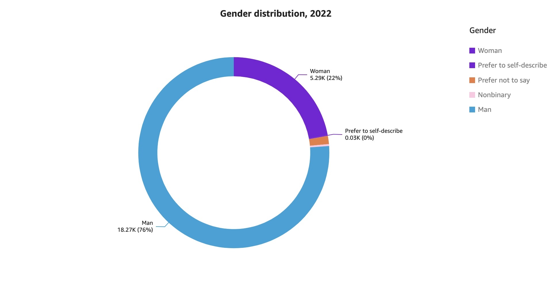
The “Suggested Insights” QuickSight provides contain a comprehensive overview of our first plot, which displays the gender distribution in 2022. Although the narratives are auto-generated, QuickSight allows users to customize them to meet their specific needs and ways of displaying the information.
Since QuickSight generates these insights in widget form, we can include them in our analysis at any given moment, and modify the narrative if necessary. Simply click the “+” button to add them to the sheet and click on the “Customize narrative” to make changes if desired.
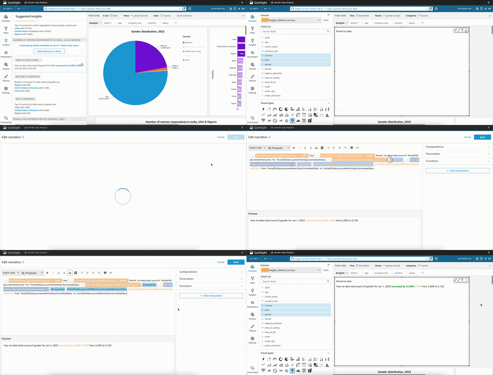
With just a few clicks, QuickSight helps users get the most out of their data by providing valuable information such as the top values, percentage changes over time, highest and lowest values, and much more. This is particularly useful for quickly analyzing the key details of a feature – for example calculating the year-to-date comparison between two years – which would otherwise require a considerable amount of time from a BI analyst.
Overall, QuickSight lives up to its name, since it is an extremely useful tool for anyone looking to get quick insights from their data! Its user-friendly interface makes data analysis more accessible, helping users kickstart and inspire their analyses in just a matter of seconds.
QuickSight Forecasts
Last but not least, QuickSight offers the option to add forecasts to our graphs. With the help of an in-built Machine Learning algorithm, QuickSight allows users to forecast how their data will behave in the future.
All we need in order to forecast our data is a date field and the metrics that we want to evaluate. In this case, we will be forecasting the gender wage gap in the United States to try and predict, based on past data, whether this gap will decrease in the future. (4)
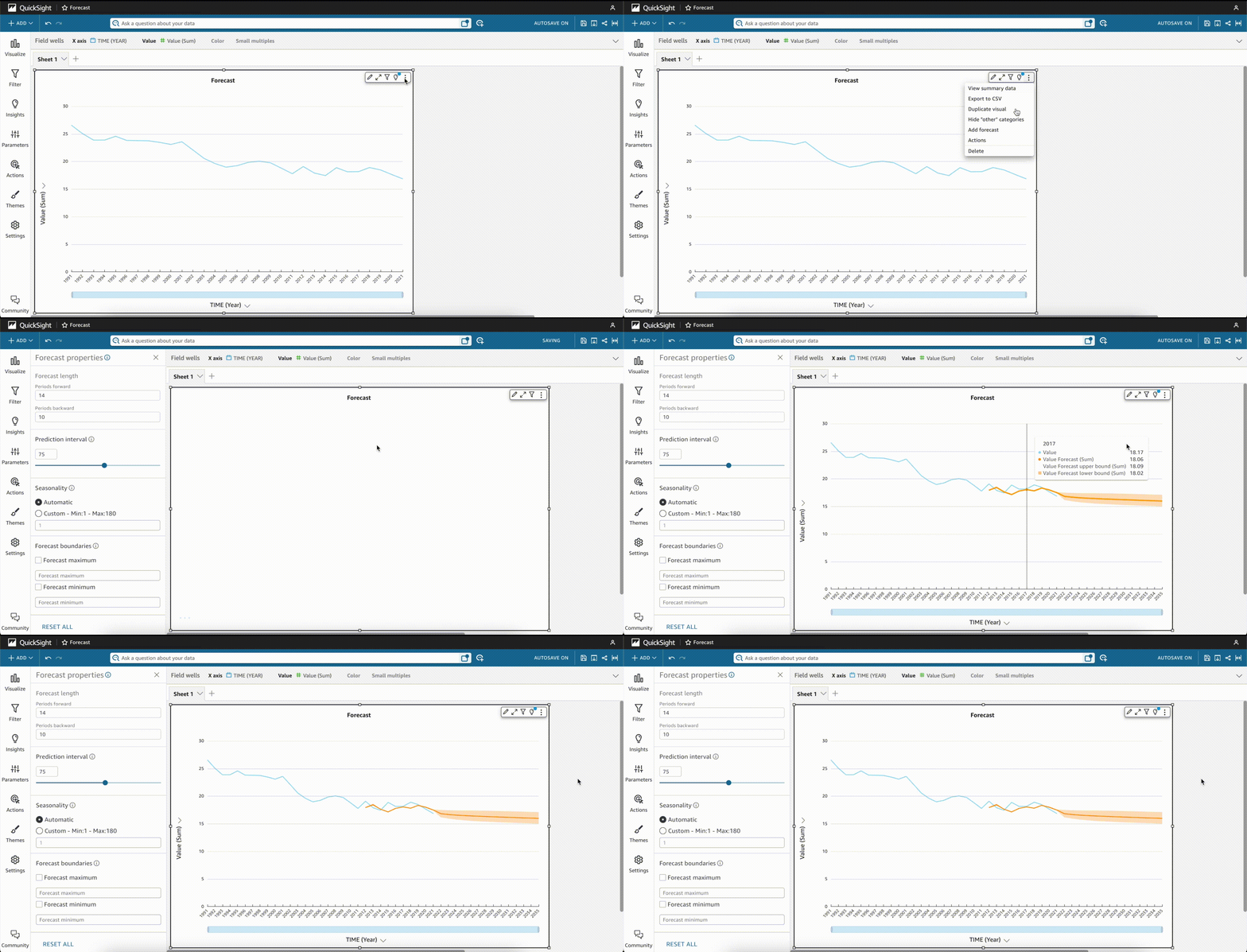 So to add a forecast to our plot, we have to click on the option “Add forecast” and automatically its properties will open up.
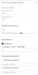
Through these parameters, we can fine-tune our prediction by changing the periods forward we want to forecast, the periods backwards we want to use to determine patterns in the data , and the confidence level used to build the prediction interval. QuickSight by default detects the seasonality in the data automatically, however this can be changed if another time period better reflects the seasonal pattern found in the data. Finally, boundaries can be added to the forecast values if necessary, ensuring that they do not surpass these limits.
What is also interesting is how QuickSight provides extra information for each parameter, so even if you are unfamiliar with what seasonality is, you can get an understanding of what is expected by hovering over the information bubble next to the parameter name.
Conclusion
Undoubtedly, QuickSight technologies such as Q, Insights and Forecasts are incredibly powerful tools that can provide organizations with valuable insights, and forecasting capabilities. By utilizing these, organizations can gain valuable knowledge on their businesses in more efficient ways and with little prior knowledge on the technical aspects of the tools. With the right implementation QuickSight can help organizations stay ahead of the curve and make better decisions. So, take the leap and go beyond the limits of data with QuickSight!
Interested in exploring the use of Quicksight to draw business insights? As AWS Advanced Partners our team at Montevideo Labs has extensive experience with AWS services at scale. Contact our team to learn how we can help you in your cloud journey!
References
AWS Events. (2022, December 2). AWS re:Invent 2022 – Get clarity on your data in seconds with Amazon QuickSight Q (BSI207). YouTube. Retrieved March 24, 2023, from https://www.youtube.com/watch?v=BkjUSd8JK9c
Earnings and wages – Gender wage gap. (n.d.). OECD Data. Retrieved March 24, 2023, from https://data.oecd.org/earnwage/gender-wage-gap.htm#indicator-chart
Forecasting and creating what-if scenarios with Amazon QuickSight – Amazon QuickSight. (n.d.). AWS Documentation. Retrieved March 24, 2023, from https://docs.aws.amazon.com/quicksight/latest/user/forecasts-and-whatifs.html
Working with insights in Amazon QuickSight – Amazon QuickSight. (n.d.). AWS Documentation. Retrieved March 24, 2023, from https://docs.aws.amazon.com/quicksight/latest/user/computational-insights.html
Stay ahead of the curve on the latest trends and insights in big data, machine learning and artificial intelligence. Don’t miss out and subscribe to our newsletter!

 It goes without saying that technology has drastically changed our world – from the way we communicate, work and study, to the way we spend our free time and access information. Ever since the global pandemic, technology has found even more ways to establish itself in our lives. However, despite the industry’s undoubted growth and impact on society, there is still one big issue that often goes unnoticed: the gender gap. In the tech industry, women are severely underrepresented, which not only is detrimental to their own professional aspirations, but also to companies’ potential for innovation and creativity.